Deviation Actions

Basically, I encountered yet another person who cannot grasp the difference between concept and visual aesthetic, and is quick to brand any widespread concept as similar to some popular piece of media that utilized such a concept.
I personally define visual aesthetic in concept art as series of image elements, art techniques and stylistic patterns that unify an array of objects in art into a single, wholesome, stand-out microcosm which is recognized by these elements. It's what allows us to relate a piece of art to a certain time period ("that's so 80's!"), a culture ("typically oriental stuff!") or movement ("absolutely baroque!").
A concept, on the other hand, is a concept – an idea made into flesh. The concept might have a definitive visual aesthetic, or it could be generic. Therefore, the concept is WHAT, and aesthetic is HOW.
However, many people seem to greatly mix the two, or mistake visual aesthetic for style and technique, which are components of the aesthetic, but not it’s contenders.
Here is what I mean under a visual aesthetic. I want you too look at these screenshots of very popular media, game and film, and get a hang of what I’m talking.
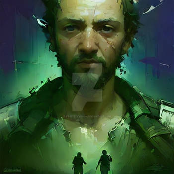
Since this blog entry was spurred by Deus Ex: Human Revolution, which I’m sure many of you played, let’s look at it first:
The most glaring visual aesthetic motifs for DE:HR is the color pallete, which falls into black and yellow/gold/orange. Most of the interface is coded in those two colors. The light and bloom effects, that tinge the games "atmosphere" is in most environments, yellow as well. Such a strict color coding immediately sets a major visual aesthetic theme. Second thing – triangles. Triangles are repeated in most of the environment, deco and character designs, along with pronounced edges in environment and object design. While the exposition may vary, the triangles and angled surfaces find their way in most of the game. And lastly, another big visual aesthetic component of DE:HR – is a use of gloss and glow atop victorian-esque setups, which clashes modernity with classicism for a truly cyberpunk feel.
Dead Space, and it’s subsequent iterations have a defined visual aesthetic as well. It doesn’t just go sci-fy – again, it creates a set of visual rules that all of the game’s elements follow, and as seen on this screenshot, the most evident rule is ribbing. Ribbing is repeated in nearly every non-necromorph object in the game, starting with Isaac Clarke’s s suit, and continuing on with Ishimura’s design, the environments, interface and object. What does that achieve? Unity of space and manufacturer. The Ishimura is feeling solid, made by one company, and existing in a real world.
And the movie Oblivion, which is color-coded, and shape-coded as well. Most of the movie objects are stark white, including the protagonists suit, his hub, the drones and so on. The drones and the hero’s method of transportation share a similair, spherical contemporary design awfully reminiscent in its cleanness and simplicity Apple’s industrial design, and it manages to convey to the viewere that this is high-tech shit. It’s not just a single design, but a similair design theme running through the movie’s art production that once again ups the degree of believability.
The problem I have with a lot of modern concept art and modern art appreciators – when we’re talking about large industrial projects - is that they’re more focused on the concept, but don’t care much about upholding a unified, natural visual aesthetic.
In concept art this translates into the what I call "generic fantasy cancer", ie "everything and a sink, too!"
Why I call it generic fantasy cancer? Because most of the time, when making a fantasy concept, the artist doesn’t think about a wholesome visual aesthetic, but throws in everything in their visual library that’s about armor and medieval times. Since most of the time the visual libraries are not so big, it translates into a mish-mash of discordant and generic elements, as seen in this example:
There’s no feeling of unification and believability. In art production, say, in games, the difference between simple concepting and creating a visual aesthetic, in my opinion, is most vividly seen in the Dragon Age series. While many people hate on Dragon Age 2, I hold it in much higher regard than the first installment, Dragon Age: Origins/Awakening, both in story – but most importantly, in art.
DA: O has absolutely unremarkable visual aesthetics, indiscernable from a myriad of other fantasy RPGs. What set this game apart of it’s competition, was a compelling role-playing experience, gameplay and story arch, as also a wide set of character customization options. But the game design seems ragtag, and feels like being done by different people in different places. From the beautifully stylized Orzammar (which I think of as one of the most successful visual languages found for a fantasy race) it drops to the pits of well, this:
It’s an cutscene screenshot, demonstrating dark-spawn in all their generic, reptiloid glory with what looks like celtic knotwork patterning slapped for no reason on their generically spiky-toothy bad guy armor. The difference between character and environmental and even interface design, the disjointment of it that is demonstrated in DA: O, for me, at least takes away immersion in the game, my belief in it and the satisfaction of playing.
But with Dragon Age 2, the studio went another route, and created a whole new, standalone visual aesthetic and narrative to the game universe, which enabled to solidify its mythos, and present the game universe as something that is wholesome, and not a series of maps and battleground – a REAL place.

Now, look at the dark-spawn design for DA 2 and compare it to the DA 2 design of the main character. Firstly, while it has the same concept (ie, undeadly looking bad-guy goon), the new dark-spawn is visually different from the predecessor, and yet, related to the main character. Certain elements keep them grounded in the same space, signify they share a same reality. But the studio went further. It created environments, interface elements, loading screens, maps:
All with the same overall visual aesthetic, and that, in my opinion, was a great success. It was done through a specific color pallete, use of fonts, patterns and repeating uniform elements, while adding enough variety and sub-aesthetics to keep the thing lively.
That’s why I feel that it’s important to keep a unified, competent visual aesthetic in concept art. Unfortunately, that is largely depended on research, reference and a big inner visual library, which many artists don’t find necessary to develop or limit by not consuming enough media and art per se, because as seen in the abovementioned examples, the correct thing might be found anywhere in our lives – in architecture, in fine art, in historic pieces, in home appliances and etc. Not just in other media.
I constantly try to keep this in mind when I design characters, outfits and other objects. I try not to delve in disjointed ragtagness and keep the relationship between concept and aesthetic as organic as possible. Doesn’t work at times – maybe, but that’s not a detractor. Because I believe that a concept art’s impact lies 90% in solid visual aesthetic, and only 10% - in the concept on it’s own, and its just a matter of practice and determination to create you own either from scratch or through inspiration in your whole life experience of observing the world around/